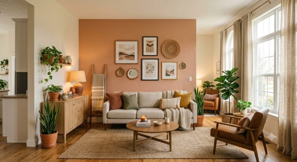
There’s already plenty of advice out there about where to hang living room wall decor and how big it should be. This guide skips that part. Instead, it’s about the question that actually trips people up once the piece is on the wall: does the color, tone, and style of what you’ve chosen actually work with the room it’s in?
Most living room wall decor mistakes aren’t sizing mistakes, they’re mismatch mistakes. A piece that’s beautiful on its own can still clash with the wall color, the furniture, or the overall mood of the room, and no amount of correct hanging height fixes that.
At Homzent, we spend a lot of time helping people work through exactly this problem. This guide walks through the color palettes, style pairings, and one frequently overlooked detail (the frame) that determine whether your living room wall decor feels pulled together or just placed there.
The Order Most People Get Backwards
Here’s a sequencing mistake worth calling out before anything else: most people pick their wall paint first, then go shopping for art to match it. Designers tend to do the opposite.
If you already love a piece of art, a vintage find, a print, a photograph, pull the second most common color out of it, not the loudest one, and use that as inspiration for your wall paint or accent tones. The dominant color in a piece often clashes when it’s repeated on the wall behind it; the quieter, supporting color usually blends better.
If you’re starting from a blank wall instead, the opposite order works fine: choose your palette first, then shop for art and objects that share at least one color or tone with it, even if they don’t match exactly.
Warm, Earthy Living Room Wall Decor
Warm, natural tones continue to dominate living room color choices, and for good reason, they photograph beautifully but also just feel calming to actually live with.
- Terracotta and clay tones. These warm, muted oranges pair naturally with wood furniture and woven textures, giving a room a grounded, sun-warmed feel.
- Olive and sage green. A deeper, richer alternative to sage, olive green works well as an accent wall or through wall art, plants, and ceramics.
- Muted browns and warm greys. These provide a soft, neutral backdrop that lets other elements, art, textiles, and lighting, do more of the visual work.
These earthy tones work especially well when layered rather than used as a single flat color, think a terracotta-toned print, a woven wall hanging, and a wood-framed mirror all in the same warm family.
Bold and Moody Wall Decor Ideas
Not every living room wants to feel calm and neutral. Bold, saturated color continues to gain ground as a confident alternative to all-neutral rooms.
- Deep blue or navy. A rich, moody blue on an accent wall or in large-scale art adds drama without feeling cold, especially when paired with warm lighting.
- Rich burgundy or wine tones. These deep reds bring warmth and formality, working particularly well in more traditional or eclectic living rooms.
- Black accent walls. Once considered risky, a single black wall styled with floating shelves, art, and warm accessories reads as intentional and sophisticated rather than heavy.
Bold color works best when it’s contained, either to one wall, one large piece, or a tightly edited color story, rather than spread evenly across every surface in the room.
Soft Neutral and Pastel Wall Decor
At the other end of the spectrum, soft, muted palettes remain a dependable choice, particularly for smaller or lower-light living rooms.
- Warm white as a backdrop. A warm (not stark) white wall lets almost any art or accessory color shine without competing for attention.
- Soft lavender, blush, or pale blue. These gentle tones suit minimalist or coastal-leaning living rooms and pair well with light wood and airy textiles.
- Layered neutrals. Mixing several shades of the same neutral family, cream, taupe, warm grey, adds depth without introducing any bold color at all.
Soft palettes are the most forgiving option if you’re still figuring out your style, since almost any wall decor piece will sit comfortably against them.
The Frame Color Nobody Thinks About
Most people focus entirely on the art itself and treat the frame as an afterthought. In practice, the frame is really a third color in the room, sitting between the wall and the art, and it changes how everything reads.
- Black frames feel crisp and modern, and pair best with cool or neutral walls; on a very warm cream wall, black can feel slightly heavy.
- Wood frames feel warm and organic, and generally want a warm wall behind them; on a cool grey wall, wood tones can look unexpectedly orange.
- Gold or brass frames need warmth around them to avoid looking cheap, pairing well with deep, warm colors like olive or terracotta, or a warm white.
- No frame at all (canvas or gallery wrap) puts the full weight of the color relationship on the art itself and the wall behind it, so getting that pairing right matters even more.
This single detail, matching frame tone to wall tone, is one of the fastest ways to make existing wall decor feel more intentional without buying anything new.
Matching Wall Decor to Your Living Room’s Personality
The right style of wall decor also depends on how the room is actually used, not just how it looks in photos.
- Formal living rooms tend to suit a single, more subdued piece, a traditional landscape, a textured abstract, or soft brushwork, rather than a busy gallery wall.
- Casual, lived-in living rooms are a natural fit for a mixed gallery wall, combining photography, prints, and even textile pieces for a collected, personal feel.
- Bohemian or eclectic living rooms can support the most visual variety, mixing mediums, colors, and even mismatched frames without it feeling chaotic.
- Rooms with a view may not need much wall decor competing for attention at all; pulling one or two colors from the view outside into your wall decor can be enough.
Wall Molding and Textural Wall Treatments
Color isn’t the only lever available. A growing number of living rooms are adding dimension to the wall itself before decor even enters the picture.
- Picture frame molding. Traditional and versatile, this adds structure to a plain wall and works with almost any paint color.
- Modern patterned molding. A more contemporary take, using geometric or unconventional molding layouts as the wall’s main visual feature.
- Layered texture through decor. Combining a woven piece, a smooth framed print, and a matte ceramic object on the same wall adds richness even without any structural changes.
These treatments work especially well as a base layer, since they add interest to a wall even during the months you haven’t settled on final art or color yet.
Budget Wall Decor vs. Investment Wall Decor by Style
| Factor | Budget Approach | Investment Approach |
| Color Changes | Paint one accent wall, swap smaller decor pieces | Full-room color drenching, custom wall treatments |
| Art | Prints, posters, budget frames | Original art, custom framing matched to the room |
| Texture | Woven or textile pieces, affordable and easy to change | Wall molding, paneling, or professional installation |
| Best For | Testing a bold color or style before committing | Long-term, fully resolved rooms |
At Homzent, we usually recommend testing bold or moody colors through smaller, swappable pieces first, a single framed print, a textile hanging, before committing to a full accent wall or structural treatment.
Common Color and Style Mistakes to Avoid
Matching the wall color to the art too exactly. Repeating a piece’s dominant color on the wall behind it often flattens the contrast that made the art stand out in the first place.
Ignoring the frame. A beautiful piece in the wrong frame tone can clash with a wall color that would otherwise work perfectly.
Going too matched. A living room where every color and material matches exactly can feel more like a showroom than a home; a little intentional variation reads as more personal.
Choosing a style that doesn’t fit how the room is used. A busy, eclectic gallery wall can feel overwhelming in a formal room meant for quiet entertaining, just as a single subdued piece can feel underwhelming in a casual, high-energy family room.
Committing to bold color across an entire room at once. Testing a bold or moody tone through decor first, before painting every wall, avoids an expensive do-over if the color doesn’t hold up once it’s everywhere.
Frequently Asked Questions
What color wall art goes best with a living room?
It depends on your wall color: warm whites and neutral backdrops work with almost any art color, while a colored wall pairs best with art that shares a supporting tone rather than matching the wall exactly.
Should wall art match the wall color?
Not exactly. Art that repeats the dominant wall color too closely can look flat, while art that shares a secondary or supporting tone with the wall tends to create better contrast and visual interest.
What is a good accent wall color for a living room?
Deep blue, olive green, terracotta, and black are all popular accent wall colors currently, each suited to a different mood, from calming and earthy to bold and dramatic.
Does frame color matter for wall art?
Yes, frame color acts as a third color between the art and the wall; black frames suit cool or neutral walls, wood frames suit warm walls, and gold or brass frames need warm tones around them to avoid looking out of place.
How do I choose wall decor for a formal living room?
Formal living rooms tend to suit a single, more subdued piece, such as a traditional landscape or a textured abstract, rather than a busy, mixed gallery wall.
What is a good neutral wall color for living room art?
A warm white or soft greige is often recommended, since it acts as a flexible backdrop that lets nearly any art or decor color stand out without clashing.
Is a black accent wall too dark for a living room?
Not necessarily. A black accent wall styled with floating shelves, art, and warm lighting often reads as sophisticated rather than heavy, especially when the rest of the room stays lighter.
Final Thoughts
Getting living room wall decor right isn’t really about finding the perfect piece of art, it’s about understanding how that piece’s color, tone, and frame relate to everything else in the room. Once that relationship clicks, even a modest, affordable piece can look far more intentional than an expensive one chosen without any of this in mind.
Start with the color story you’re drawn to, warm and earthy, bold and moody, or soft and neutral, and let your wall decor choices follow from there rather than the other way around. That’s the kind of detail-first thinking we like to bring to every guide at Homzent.